Sarah Greenwood

AS: There was a stark contrast in Atonement between the country house and wartime Dunkirk. You went from a colorful to a desaturated palette and then there was red associated with Cecilia and green in the house. Is color-design a big part of your work on a film?
SG: It is, actually. And you use it many different ways. Interestingly, green is a color I tend to stay clear of, and to use the amount of green we used in the house in Atonement was not what I would normally do. But it’s a decision that we made. Like the green of the corridor and that kind of arsenic green of the servants’ area. We referenced a fantastic house called Tyntesfield where the walls were painted that arsenic green. It’s like you wouldn’t have dared to use it had you not seen it with your own eyes. So yes, that green was a very specific color in the house and in that whole first part, the garden and the lake and Keira’s dress. Joe wanted a dress that was what he called “paddy green”. It was a very vibrant kind of Irish green. The dress was incredible. Very bold and very much a statement on Joe’s and Jacqueline Durran’s part as well.
And that house was a listed house but it wasn’t National Trust -it was empty. The woman who had inherited it had to sell off all the furniture to pay for the roof and other renovations so it really was a blank canvas. There was no furniture in it and there was no wallpaper, there was nothing. It wasn’t derelict but it was empty. Which was just brilliant for us and we just moved in.
AS: You always wonder how much of those places were like that and how much was brought in.
SG: It varies. On Pride and Prejudice we did this whole thing to the Bennett House that was a listed house so you couldn’t touch the walls. What we ended up doing was kind of cladding the hall and some of the stairs and then building within the room. We rebuilt all the paneling, within the room, so we could paint it. Which was quite extreme. Ordinarily you might have built that on a stage because the interior was quite small, but Joe wanted the interior and the exterior to work together. That was just such a fantastic house. And again, it wasn’t lived in so we were given kind of carte blanche as long as we didn’t affect the actual fabric of the building.
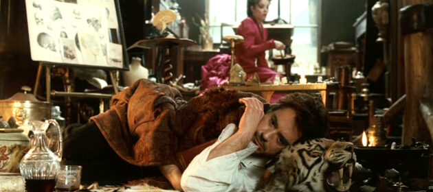
AS: In Sherlock Holmes, his amazing office doesn’t feel like a set -it feels like a real place.
SG: What was interesting there was the set had to say so much about Sherlock. Every single thing had to have a reason and a rationale. So we dressed it and we showed it to Robert and he just said, I want more. The philosophy was that he would have rented those rooms and that the wall-coverings and the key pieces of furniture would all be in there from Mrs. Hudson. And then it’s what Sherlock did to the room. Which is de-construct it in a way and then layer it up with all the things that he would have done: past cases, rationales, disguises, you just build on and on and on. Frankly what we’ve done on Sherlock II is even more extreme! I looked at that set and I don’t know how they could shoot it. Because you couldn’t walk in it, let alone take a camera in there. They did. And also Philippe Rousselot is an amazing DP. The way he works with the set and the way he lights really brings it to life.
Pingback: Laurence Bennett