Jess Gonchor
AS: You’ve worked with the Coen brothers a lot –how much input do they have on the visual side of things?
JG: They have a tremendous amount of input. I always say it’s like a team effort. It’s like having two other really talented production designers on the job. They’re very close to the story. If they haven’t written something that’s original they’ve adapted it. I truly believe they have something in mind as they’re putting it down on the page. So they’re very involved with the look of the movie. Usually we’ll talk about it, they’ll hand me the material and we’ll talk about it some more. Then they’ll sort of let me go on my own and I’ll gather up some photos or generate some drawings or take some of my own photos. Do an exploratory view of what I think this thing is going to look like. Then I’ll come back and lay it all out on the table and we’ll decide, This is good. This over here is good, and then sometimes those things trigger other ideas. So it’s really a back-and-forth thing between myself and them.
Obviously the first movie we did together was about getting to know each other and each other’s style. It’s gotten a little bit easier as the movies have gone on. They really have an amazing vision not only for the writing but for the look of the movie. I feel really fortunate to be working with them versus somebody who just leaves the entire thing in my lap. That’s fine too, but it’s just nice that we push each other.
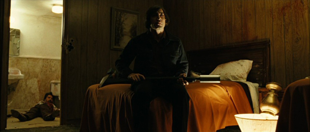
AS: No Country for Old Men won four Oscars and is one of my favorite movies. One thing I love about it is that very distinct color palette. It has that whole sepia-tone feel.
JG: That’s definitely what we were going for. You know it seems like half of my job is praying for good weather or bad weather. In the summer that location traditionally should have been quite green but they were in a drought so here I am cheering for the drought to continue while the rest of the state is worried about their water consumption. It wasn’t until the very last day of shooting that it opened up to really rain buckets so I was happy about that.
I tried to give the sense of West Texas and Mexico and tried to keep it in those tones. The palette of the earth. You take a shovel of the ground –that’s what’s going to come out down in those parts of the States. Between Roger [Deakins]’s amazing work and costume designer Mary [Zophres] we managed to keep it mainly in that strike zone.
That was the first thing I came up with. I made a sheet, a knock-off Rothko of the colors that I thought should be in the movie. It was the very first thing I presented to Joel and Ethan and I was like, What do you think about this as a general tone for the movie? And they said, Yeah, that’s great! So those five colors were what we stuck with the whole movie. And I think we did a good job with that.
Pingback: Sarah Greenwood